
bottlegreen
Cordials & Pressés
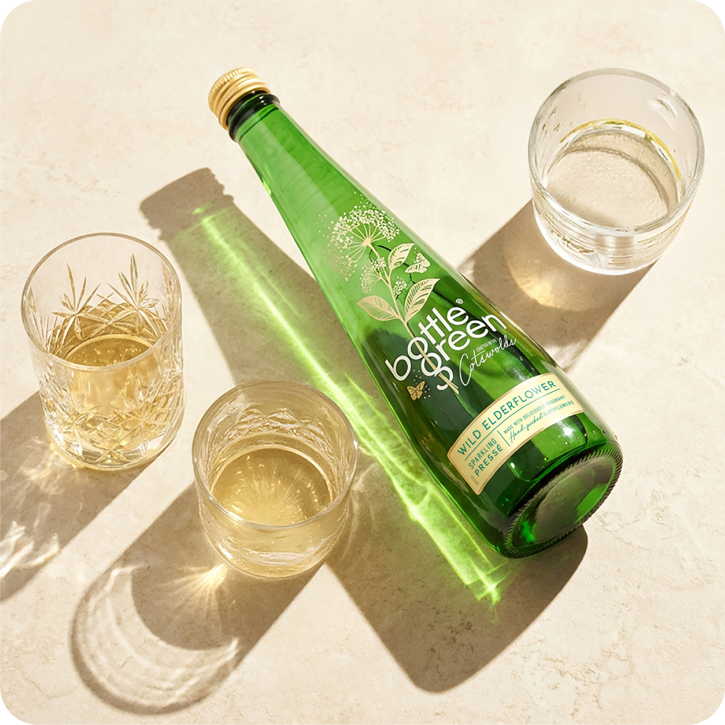
Challenge
bottlegreen’s core cordial and pressé range had drifted away from the sophistication that once defined the brand. The challenge was to reintroduce that elegance, drawing on a more classic bottlegreen look whilst ensuring the brand was able to compete credibly against competitors.
Solution
Refined the design system to feel quieter and more premium, letting the brand’s heritage cues come through without looking dated.
Gave the iconic bottle shape more of the spotlight as the key point-of-purchase asset, supported by considered typography, restraint, and a cleaner overall hierarchy.
Shift
Repositioned bottlegreen’s core range as confident, crafted and elevated. Restoring a sense of sophistication while strengthening shelf presence through the bottle itself, not just the label.
“The refreshed design has re-established bottlegreen as a premium, crafted brand. The work strikes a careful balance between heritage and modernity, with the bottle itself becoming the hero at point of purchase. It’s a confident step forward for the core range.”
Brand Manager SHS